As well as a writer, I’m a UX designer. I’ve wanted to write a more design focused blog post for a while, but it hasn’t seemed wholly relevant to the theme of this blog (until today). There are two dual areas I’ve been researching; dystopian science fiction and dystopian design. I want to talk, specifically, about book cover design for dystopian fiction and why it’s important.
The book cover is described by Catherine Milne as an “increasingly sophisticated marketing tool” (2019) and it’s one of the most important aspects of the release of your book:
“A book cover has to: a) grab your attention, b) tell you enough about the book to understand what genre it is – that is, what kind of book it is and if you’re likely to read that kind of book – and then c) make itself compelling enough that you pick it off the shelf and – hopefully – decide you might like it and take it to the counter to buy it.” (2019).
It’s interesting then, that Tim Krieder identified a lull in these designs back in 2013, attributing it to over simplification:
“The single-object-on-white-background cover has become such a recognizable formula that there is now a Malcolm Gladwell Book Generator” (2013).
This has rapidly turned around as a result of the rise of social media. In 2018 Holly Connolly wrote an article for the guardian citing a rise in the trend of book covers as a result of social media: “If I don’t like the cover, I won’t photograph it and put it on my feed,’ says Femke Brull, a ‘bookstagramer’ who runs @booksfemme” (Brull as cited in C onnolly, 2018). This has put the emphasis back on book cover aesthetics.
View this post on Instagram
This is a really long way of saying that book covers are important, increasingly so in dystopian fiction. Before we get there though, let’s look briefly at what dystopian fiction actually is.
What is dystopian fiction?
According to this TED talk, a dystopia is the product of the rules we put in place to try and achieve a utopian society. Look at the USSR as an example, while everyone is familiar with the KGB and Russia’s ‘state secrets’, few have stopped to actually look at their propaganda and think about how these groups were the products of attempts to achieve a utopian ideal, a communist one.
Communism also wasn’t initially viewed as a negative ideal in Russia (like it commonly is in Western cultures). Communism freed Russia from a monarchy that was creating a lot of discontent (to learn more, look into the Bloody Sunday riots, rising poverty, poor working conditions and lack of land).
Dystopia, as Gerhard explains, is an antonym of utopia (2012, p. 7). It translates as “not good place” (the term ‘utopia’ coming from Sir Thomas More’s novel Utopia, which was published in 1516 and talked about a society with minimal crime, violence and poverty) (Gerhard, 2012). Many scholars (e.g. Gerhard, Moylan and Huxley) believed that dystopia was rooted in utopian ideals. As Moylan explains:
“dystopian narrative is largely the product of the terrors of the twentieth century: A hundred years of exploitation, repression, state violence, war, genocide, decease, famine, ecocide, depression, debt, and the steady depletion of humanity through the buying and selling of the everyday life provided more than enough fertile” (2000, xi).
This is the underbelly of utopia and is evident in the earlier example where we saw the collapse of soviet ideals. Many people saw this as proof that utopia was untenable (Ruppert, 1986, p. 100).
The two world wars also questioned these utopian ideals and a lot of the media started to consider other possible threats to our society. As Eugen Weber explains: “more than disillusion with existing conditions and aspirations, the anti-utopian expresses the conviction that there is no hope elsewhere, no hope in what must be only variations on the same theme” (2017, p. 163).
So what is dystopian fiction?
Dystopian literature has science fiction tones to it. These novels are often set in futuristic worlds and portray a society where current concerns have been pushed to the extreme. This is case in 1984 where government control and surveillance is emphasised, or in Brave New World, which looks at the consequences of the banishment of the natural world from daily life. As M.Geetha explains:
“writers like H. G. Wells, Aldous Huxley, George Orwell, Margaret Atwood, and others have portrayed fictional futuristic societies which serve as fair warnings to real societies and people of the respective ages. All have portrayed societies where man would have let science take over humanity, the subsequent consequences and how the protagonist and his or her society too suffer. The consequences often portray loss of identity, individuality, human tendencies, basic human instincts, morality, and culture in general.” (2014).
Other common themes includes class divides and repression, the concealment of information as state secrets (looking at you USSR), as well as police brutality. You don’t have to watch the news for long to see many of these concerns reflected back at you in the form of data retention, Wikileaks, the black lives matter movement, asylum seekers, and immigration. The list could be endless.
Works in the dystopian genre therefore allow readers to “compare and contrast the present and future” (Geetha, 2014), comparing the utopia they are striving for to the dystopia they will likely end up with. As Professor Gregory Eck reflects, “Because… utopia is rooted in theory, it will not always work. In fact, more is written about the failure and impossibility of utopia than of its success, probably because the ideal has never been reached.” (2001).
In other words, we each have our own idea of utopia, and it’s impossible to have us all collectively striving for the same goal.
What role does design play in dystopian fiction?
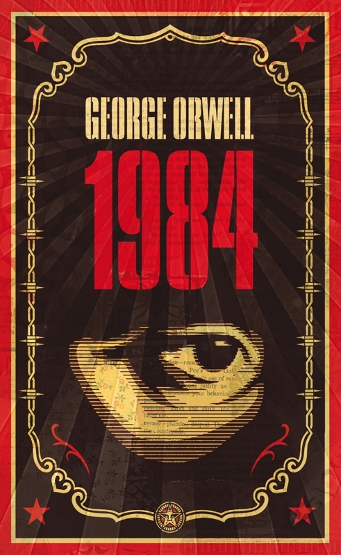
Design, even in fiction, plays an important role in bringing a dystopian world to life. This is because design does a very good job of using symbols to represent the dichotomy that is the utopian ideal and the dystopian reality. Look, for example, at this cover of Orwell’s 1984 and the prominent use of the eye as representing surveillance. This is represented repeatedly across different editions of the book. However, coming back to this 2008 edition for a moment, there are other design elements that are easily missed.
Orwell’s novel has many parallels with the USSR, being broadly based on the regime (though not as obviously as Animal Farm). The particular book cover shown above features the red star from the USSR flag – a symbol of the red army’s uprising and the communist revolution. It is often positioned above the hammer and sickle to show the party as leading and uniting the working class. The red colour is also used across many editions as it is symbolic of communism (the use of the red star in this way was also popularised by the USSR).

In a collection of USSR propaganda posters, Pei-Ru Keh talks about the paradox that the designs represented, which makes them particularly susceptible to being used in dystopian design: “There is an undeniable sense of excitement, optimism, and experimentation in these images, though they also convey the sanitised and one-sided version of reality that contributed to the consolidation of a brutally repressive dictatorship” (2018).


Many of these designs also draw on constructivism, a movement popularised by Russian propaganda, which thought art should be functional and not used for personal expression. They replaced the hand-painted figures used by the allies in WW2 propaganda with strong typography, photography and minimal colour palettes (usually red, black and yellow). The images were often simple, cut out by hand, and didn’t detract from the font which was delivering the key message. Many posters also featured icons of the working class (such as the sickle and axe). This constructivist approach was a welcomed cultural change from a style popularised by those they were fighting against.
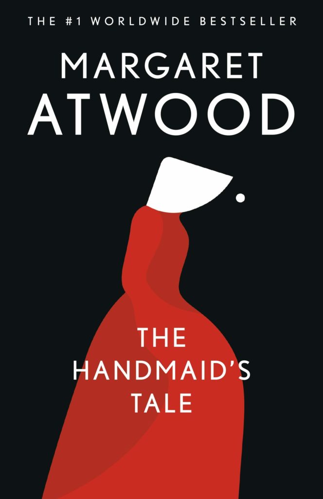
Many dystopian book covers utilise these symbols and they are often the outliers in design as they are particularly well placed to work within the constraints of the recent minimalist trend. With that being said, many self-published novels still defy this trend, featuring elaborate designs and dystopian landscapes. This is not the case with many larger publishers, who still opt for the use of symbols, such as that of The Handmaid’s Tale which features the red silhouette, symbolising fertility and birth (and again, draws on constructivist use of shape).
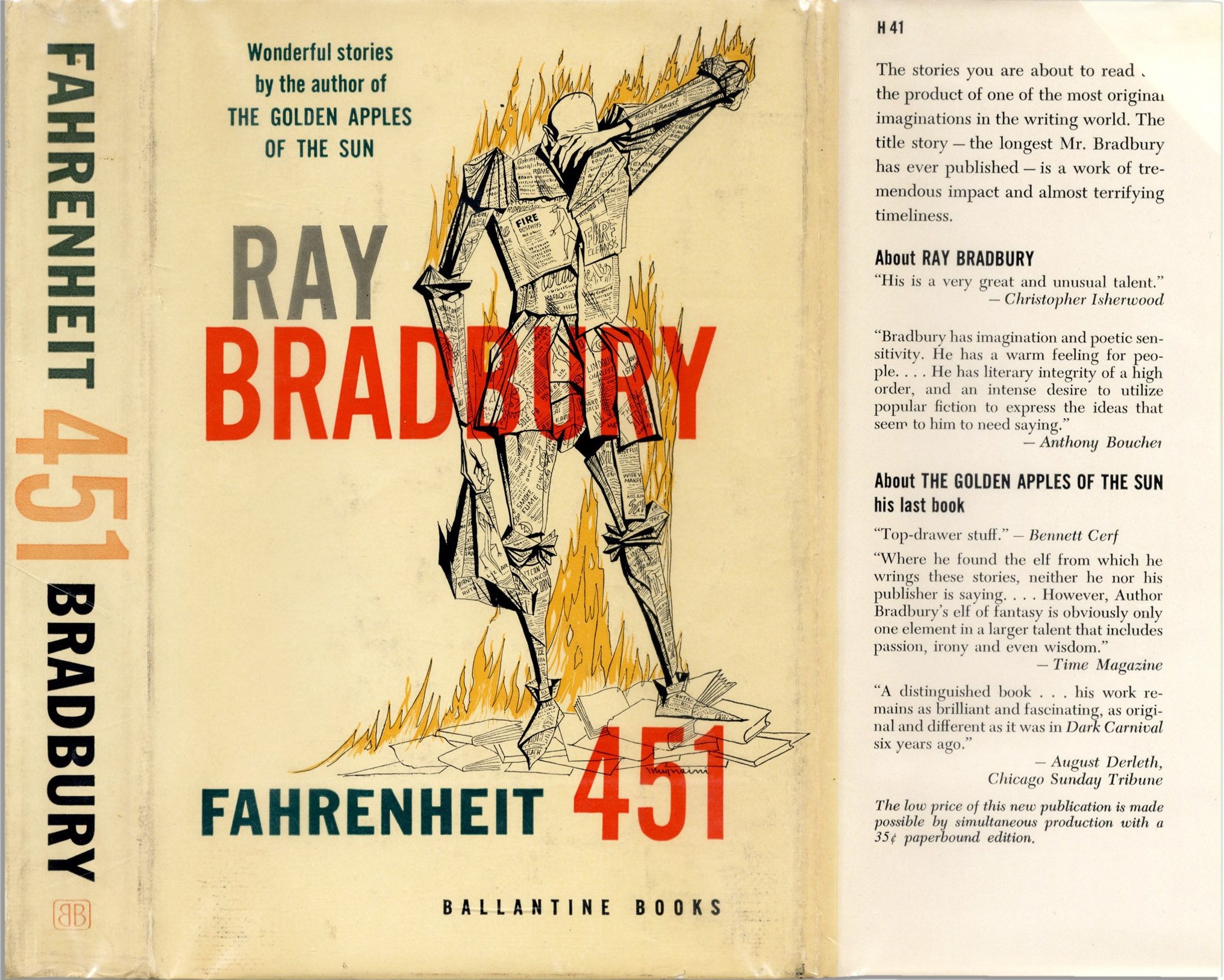
Take, as well, the original cover of Fahrenheit 451; while later minimalist examples feature just the flames, and some show books on fire, the original cover, quite aptly, features a man on fire, symbolising the book’s connection to the human psyche. It also draws on the illustrative style of UK propaganda.
This minimalist trend in book covers is quite suited to the emphasis of symbols in dystopian design, drawn quite often from the propaganda for the regime that inspired the work.
References
Connolly, C. (2018). Is social media influencing book cover design? The Guardian. Retrieved 3 September 2019, from https://www.theguardian.com/books/2018/aug/28/is-social-media-influencing-book-cover-design
Eck, G. (2001). “Utopian Studies: A Guide.” Utopian Literature: A Guide.
Geetha, M. (2014). Theory of Dystopia Unfolded – A Bird’s-eye View of Shirshendu
Mukhopadhyay’s “The Insect”.IOSR Journal Of Humanities And Social Science 19 (7). Retrieved from http://www.iosrjournals.org/iosr-jhss/papers/Vol19-issue7/Version-4/R01974117119.pdf
Gerhard, J. (2012). CONTROL AND RESISTANCE IN THE DYSTOPIAN NOVEL: A COMPARATIVE ANALYSIS. Faculty of California State University, Chico. Retrieved from http://csuchico-dspace.calstate.edu/bitstream/handle/10211.3/10211.4_434/4%2018%202012%20Julia%20Gerhard.pdf?sequence=1
Kei, P. H. (2018). The Soviet propaganda graphics that shaped the Russian Revolution. Wallpaper. Retrieved from https://www.wallpaper.com/art/soviet-propaganda-graphic-design-wolfsonian
Kreider, T. (2019). The Decline and Fall of the Book Cover. The New Yorker. Retrieved 3 September 2019, from https://www.newyorker.com/books/page-turner/the-decline-and-fall-of-the-book-cover
Milne, C. (2019). Why you should judge a book by its cover. [online] The Daily Telegraph. Available at: https://www.dailytelegraph.com.au/entertainment/books/how-to-judge-a-book-by-its-cover/news-story/4c5d47fc6eae33ca6801c5c310fcb4ed [Accessed 3 Sep. 2019].
Moylan, T. (2000). Scraps of the Untainted Sky: Science Fiction, Utopia, Dystopia. Boulder: Westview Press.
Ruppert, P. (1986) Reader in a Strange Land: The Activity of Reading Literary Utopias. Athens: U of Georgia P.
Webber, E. (2017). The Anti-Utopia of the Twentieth Century in G.Kateb (ed). The Anti-Utopia of the Twentieth Century. Routledge: New York.